Letterpress Printing : Colour
As it is national stationery week – I wanted to continue the blog posts on the letterpress process (if you haven’t read anything yet might be best to start with my letterpress introduction and then impression)
Today a little bit more about colour and letterpress.
Things to know : No 1 - Each colour is printed separately
In letterpress we use a relief plate or type which is inked and then pressed onto the printing surface. The printing press itself will have rollers which are designed (as part of the printing motion) to run over the inking disc to collect ink then onto the face of the plate and cover it with ink.
Rollers and inking disc on little Adana press
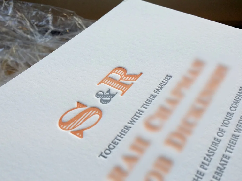
This means each colour in a design needs its own plate and will be printed separately. What does this mean for you? The more colours in the design the more it will cost. And you can do very cool things with overlapping colours!
Things to know : No 2 – Letterpress inks are transparent
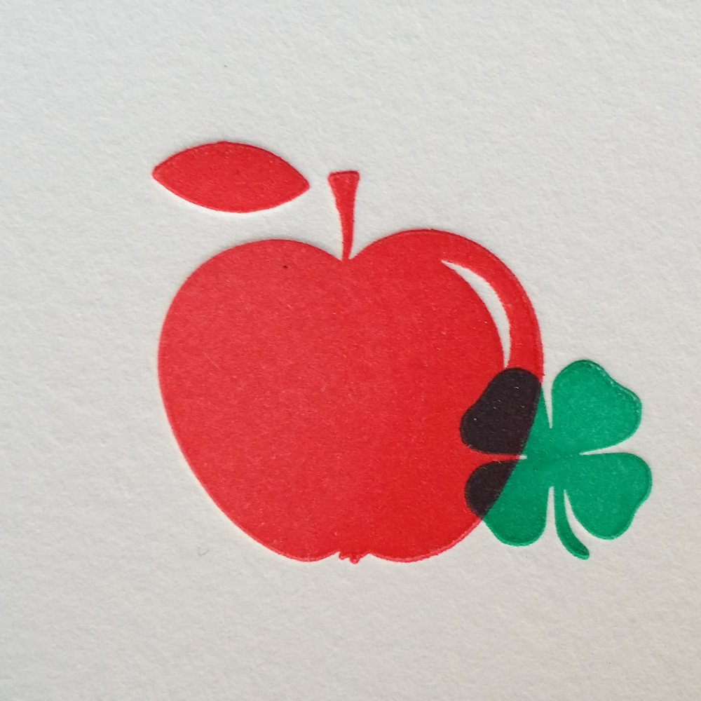
That’s really a does what it says on the tin kind of statement. The inks are transparent rather than opaque which given each has to be printed separately means we can do some really nice things with overlapping. In the letterpress world this is called ‘overprinting’ and as the inks are transparent you can see the shape of the layer below which is really nice in some designs.
Things to know : No 3 – Letterpress ink colours are hand-mixed
Rather than putting in a CYMK or RGB value each letterpress ink is hand-mixed. Being a hand process that means it isn’t always perfect but if I do say so myself we are pretty damn good at “mixing to match” – if you do want a mixed to match colour we recommend posting a sample of the colour you want. As lets face it all screen and printers print slightly different colours!
To be continued .......


